



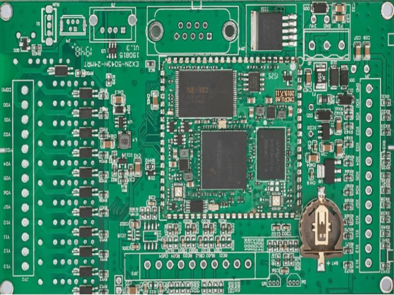
Yield Analytics in PCB Manufacturing
Yield data analytics is the work of turning a stream of production records into decisions. Most shops already collect the data they need, in travellers, inspection results and test reports, and most of it is never examined beyond the summary figure that appears in a monthly report. The value is not in collecting more data but in asking specific questions of the data that exists, and in being willing to act when the answer is inconvenient.
From Reported Yield to Understanding
A reported yield is an outcome, not an explanation. It says how many boards passed and nothing about why the others did not, and two shops with identical yields can have completely different problems. The analytical work begins when the figure is decomposed by process step, by machine, by product family and by time, because that is the point at which the pattern behind the number becomes visible.
Decomposition should follow the decisions the shop can make. Splitting by machine answers a maintenance question, splitting by product answers a design question, splitting by shift answers a training question and splitting by time answers a drift question. Analysing the data in a way that does not correspond to any available decision is the most common reason that data analysis produces nothing actionable. A question that nobody can act on is a question that consumes an afternoon and changes nothing.
Defect Trends Over Time
Defect trends are more informative than defect totals, because a total mixes the effect of volume with the effect of quality. A defect count that rises because production rose is not a problem, while the same count rising while volume is flat is. Expressing defects as a rate per panel or per square metre removes the volume effect and makes the trend comparable across months.
Trends should also be examined for seasonality and for step changes. A defect rate that rises every summer may be a humidity effect, and one that jumps in a particular month may be traced to a change of material or of personnel. A control chart is a good way to present the same data, because it distinguishes a real shift from ordinary variation, which is exactly the judgement that a simple monthly comparison cannot support.

Using Statistical Analysis Correctly
Statistical analysis is useful for two questions: whether a difference is real, and how much of the variation comes from which source. Both are important, and both are frequently answered by intuition instead of arithmetic. A change in the defect rate from three percent to two point eight percent may be noise or may be a genuine improvement, and the difference decides whether the change that caused it should be kept.
The analysis does not need to be elaborate. Comparing two periods, checking a trend for significance and separating the variation between machines from the variation within a machine cover most of the practical questions in a board shop. The error to avoid is treating a small difference as a result, which leads to changes being adopted and abandoned on the basis of noise, and to a general loss of confidence in the data.
Data Quality First
Data analysis cannot be better than the data. Missing records, inconsistent reason codes and results recorded against the wrong step all produce conclusions that are wrong in a way that is difficult to detect. Before any analytical work is worth doing, the recording has to be checked, and the check is usually simpler than expected: count the records, look for gaps and compare a sample against the physical evidence. An afternoon spent on that check is repaid as soon as the first conclusion is drawn.
The most common quality problem is a reason code that is used differently by different shifts, which makes any comparison between them meaningless. A short code list with definitions, reviewed with the people who use it, fixes most of this. A second common problem is data recorded at the end of the week from memory, which is a reason to move the recording closer to the event rather than to abandon the analysis.
Presenting the Result
An analysis that is not understood changes nothing. Charts should be simple, the axis labels unambiguous and the conclusion stated in one sentence, because the audience is usually a production team with ten minutes of attention. A chart showing a trend with the change that was made marked on it does more than a table of figures, because it connects cause and effect on the same page.
It also helps to present the size of the opportunity as well as the size of the problem. A defect that costs a small amount per panel but occurs on every order is worth attending to, while a dramatic defect that occurred once may not be. Ranking defects by cost rather than by drama is what makes the analysis credible to people who have to choose where to spend their time.

From Analysis to Action
Every analysis should end with a question that can be tested rather than a statement that can be agreed with. Confirming that a defect appears predominantly on one machine leads to an inspection of that machine; confirming that it follows a particular material leads to a conversation with the supplier. Both are actions, while a conclusion that the process needs attention is not.
The action should then be verified with the next set of data, and the verification should be planned before the change is made so that the comparison is fair. This closes the loop that most analytics programmes leave open, and it is the reason that the shops which improve are usually not the ones with the most sophisticated analysis but the ones that complete the cycle, however simple the arithmetic involved. The cycle is short, and repeating it often is what produces the result.
Practical Rules
Start from the data you already collect, decompose the reported yield along the lines of the decisions you can make, and express defects as a rate rather than a count. Check the data quality before drawing conclusions, and use statistical analysis to separate a real change from noise.
Present the results in one page with the action marked on the chart, and verify each change with the following data. Yield analytics is worth the effort only when it ends in a decision, and the record of those decisions belongs with the production records so that the quality history shows not only what happened but what was done about it.
Process Control and Verification
On a design of this kind, defect trends is the item that decides how the rest of the board is arranged. Where a value sits close to a process limit, the drawing should say so, since the shop can then open the process window rather than working to a nominal figure that carries no tolerance. A stack-up that is drawn rather than described removes most of the ambiguity from a quotation, and it lets the fabricator price the board against the dielectric and copper weights that will actually be used.
FAQ
What data is needed for yield analytics? The records a shop already keeps: inspection results, test results, scrap codes, machine and shift identification, with consistent definitions.
Why express defects as a rate? Because a count rises with volume. A rate per panel or per square metre removes the volume effect and makes periods comparable.
What is the most common analytical mistake? Treating a small difference as a result. Without a significance check, changes are adopted and dropped on the basis of noise.