


Defect Rate DPPM and Yield Improvement in PCB Assembly
Quality in electronics assembly is measured in parts per million, because the processes are good enough that percentages are too coarse to be useful. A line running at one percent defect rate is producing ten thousand defective joints per million opportunities, which is a serious problem. Understanding what the DPPM figure actually counts is the first step to improving it.
Why Defect Metrics Matter
A defect metric turns a stream of individual inspection results into a number that can be compared across products, lines and time. Without it, improvement is a matter of opinion, and a change that seems to help on one product cannot be shown to help on another. With it, resources can be directed at the largest contributor.
The metric also drives behaviour, which is why it has to be defined carefully. A measure that counts reworked boards as good will always look better than one that does not, and a measure that can be improved by changing the inspection criteria rather than the process is worse than useless.
Defining DPPM Correctly
DPPM is defective parts per million, and the definition depends on what counts as a defective part and on what the denominator is. Some organisations count defective units, others count defects, and the two give very different numbers on a board with several faults. The definition has to be written down and used consistently.
The opportunity base matters as much. A figure per board rewards a simpler product and penalises a complex one, while a figure per solder joint or per placement is comparable across a mixed product range. Where several products run on the same line, normalising by opportunities is the only way to compare them fairly.
First Pass Yield and Rework
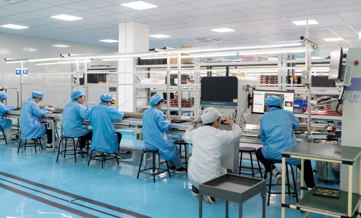
First pass yield is the proportion of units that pass all inspection and test without rework. It is a harsh measure, because it counts every unit that needed any intervention, and that is exactly what makes it useful. Rework costs money, adds handling risk and can hide a process problem that will eventually escape.
Reworked units should also be tracked separately, because a high rework rate on a specific defect indicates a process that is not in control even when the final yield looks acceptable. Rolling first pass yield and rework rate together gives a much clearer picture than either alone.
Escape Rate and Outgoing Quality
Escape rate is the number of defects that leave the factory, whether detected by the customer or found later in the field. It is the metric that matters most commercially, and it is usually far smaller than the internal defect rate because inspection removes most of the problems. It is measured at the point where the responsibility transfers.
A rising escape rate with a stable internal defect rate points to an inspection problem rather than a process problem, which is an important distinction. The inspection methods that determine the escape rate are described in this guide to automated optical inspection.
Where the Data Comes From
Useful data comes from inspection and test stations that record what they found, where on the board and with which program. A machine that only reports pass or fail produces a number but no diagnosis. A machine that reports the defect type and the reference designator produces something that can be analysed.
Manual inspection contributes too, but its results are only comparable if the criteria are consistent. Where several inspectors judge the same criteria, agreement between them should be checked, because inconsistent judgement adds variation to the data that no process improvement can remove.
Pareto Analysis and Prioritisation
Defects are not distributed evenly. A small number of categories normally account for most of the total, and a Pareto chart of defect type against count shows where to start. Working on the largest category first produces the biggest improvement for the least effort, provided the categories are defined consistently.
The analysis should also be done by location, by product, by line and by shift. A defect that appears on one product is a design or setup issue, while one that appears on all products at one station is an equipment or method issue. The same defect count leads to different actions depending on where it is concentrated. Where a defect is defined visually, the criteria and the detection method are as important as the count, and the relationship between them is discussed in this guide to X-ray and AOI inspection.
Corrective Action and Verification
A corrective action is only complete when its effect has been measured. Changing a stencil, a profile or a cleaning interval and then declaring the problem solved without checking the defect rate afterwards is how problems return. The metric that identified the issue should be the metric that confirms the fix.
Verification needs a reasonable period, because a defect rate of a few hundred parts per million produces very few events per shift. Waiting for enough data to see a change is a real constraint, and it is one reason to track both the defect count and the process parameters that cause it. The defect categories that appear most often are catalogued in this guide to solder defects and board failures.
Trending and Targets
Trend charts with control limits distinguish normal variation from a real change. A defect rate that moves within its limits is behaving as it always does, and reacting to it wastes effort. A rate that moves outside the limits, or shows a sustained shift, deserves investigation. A run of points above the centre line is more informative than a single spike, because it indicates a change in the process rather than one isolated event.
Targets should be based on what the process has demonstrated and on what the customer requires, not on an arbitrary aspiration. A target that is unreachable is ignored, and one that is already met provides no direction. The realistic approach is a stepwise improvement based on the largest remaining defect category.
Communicating Quality Performance
The numbers have to be visible to the people who can affect them. Displaying the defect rate and the current top defect at the line gives the team something concrete to work on, and it connects an individual action to an outcome. Reports that only reach management change nothing on the floor.
Reporting should also state the definition, the period and the opportunity base, so that comparisons are meaningful. A metric quoted without its definition invites disagreement about whether quality is improving, and the disagreement consumes the time that should be spent on the defects themselves. The inspection results behind the numbers are discussed in this guide to judging PCB quality.
FAQ
What is a good DPPM figure? It depends on the product complexity and the opportunity base, but assembly operations commonly work toward figures in the low hundreds of parts per million for escapes and higher internal defect rates that are removed by rework. The comparison is only valid when the definition is the same.
Why is first pass yield more useful than final yield? Because final yield can be maintained by rework, which hides the process problem and adds cost and handling risk. First pass yield shows how often the process produced a good unit without intervention, which is the number that reflects the process capability.
How long does it take to confirm an improvement? It depends on the defect rate. At a few hundred parts per million a shift may produce no defects at all, so several weeks of data may be needed to show a change. Tracking the process parameters as well shortens the feedback loop considerably.