


PCB Silkscreen Design: Text Rules, Clearance and Print Quality
What the Silkscreen Layer Is
The silkscreen is the printed legend on the surface of a finished board: reference designators, polarity marks, pin one indicators, connector labels, test point names, logos, safety marks and increasingly a QR code or a serial number. On a rigid board it is usually epoxy ink printed over the solder mask, cured and sometimes laser marked, and the artwork is generated from a dedicated legend layer in the CAD file. Nothing about the electrical function of the board depends on it, which is exactly why it is so often left until the end of the design and then found to be unreadable, clipped by pads or printed in a colour that disappears against the mask.
Why the Silkscreen Matters More Than It Looks
Assembly is the first reason. A placement operator, a rework technician and an inspector all navigate the board by its legend, and a reference designator that sits under a component or overlaps the pad next to it costs time on every unit. Automated optical inspection is the second: AOI programs compare the silkscreen against the reference and a crowded or missing legend generates false calls that slow the line. Traceability is the third, because serial numbers and QR codes let a manufacturer tie a delivered assembly back to its panel, its lot and its test data. Field service is the fourth, and it is the one that costs the most when it fails, because a technician trying to identify a test point on a densely populated board without a readable legend will spend the time somewhere else. Good DFM practice treats the legend as part of the deliverable, not as decoration.
How the Legend Is Printed
The conventional method is screen printing with a thermoset epoxy ink, which is fast, inexpensive and available in white, black, yellow, red, blue and green. It is followed by a cure, and the ink sits proud of the solder mask by a few tens of micrometres. Inkjet legend printing has become common for short runs and for fine text, because it needs no screen and can hold smaller characters. Laser marking is used where permanence and precision matter, particularly for serial numbers, data matrices and marks that must survive aggressive cleaning. The method affects the achievable minimum text size, the registration tolerance and the cost, and it should be chosen before the artwork is finalised rather than after.
Text Size and Line Width Rules
The traditional rule for screen printed legend is a minimum character height of about 0.8 mm, or roughly 32 mil, with a stroke width of at least 0.15 mm, or 6 mil, and a gap between strokes of the same order. Inkjet and laser processes can go considerably smaller, down to 0.4 mm or less in height, but the legibility limit for a human inspector does not move as fast as the printer does. As a practical guide, use the largest text that fits: 1 mm height for reference designators, larger for connector and board level labels, and keep the stroke width at roughly one sixth of the character height so the ink does not blob or break up. Avoid italic and serif fonts, which lose their thin strokes at small sizes and are harder for both AOI systems and people to read. Keep the legend font consistent across the design, because mixed fonts are one of the most common cosmetic findings in a first article inspection.
Clearance Rules That Prevent Defects
Silkscreen must not print on a pad, a via that is not tented, a test point, a fiducial or an exposed solderable surface, because ink on a pad degrades solderability and ink on a fiducial breaks the vision system’s alignment. The usual clearance is 0.1 to 0.15 mm from any mask opening, and it should be checked against the mask layer rather than the copper layer, since the mask opening is what the ink actually has to avoid. Keep text off the board edge by at least 0.5 mm so the legend is not clipped by routing, and off the V-cut or tab-routed areas so it is not destroyed when the panel is depanelised. Keep the legend clear of the keepout around fine pitch devices and of the area under a shield can, and never place a reference designator where a component body will hide it after assembly. Where space is genuinely unavailable, it is better to move the designator to a free area of the same net or to a nearby field of designators than to squash it into an unreadable size.
Colour and Contrast
Contrast is what makes a legend usable. White ink on a green, blue or black solder mask reads well; white on a white or very light mask does not. Black ink works on light masks and on gold or silver finished areas that would otherwise reflect, and yellow is a common compromise on dark masks in automotive work. The colour choice also has to survive the operating environment: an ink that fades under ultraviolet light is a poor choice for an outdoor product, and ink adhesion on a heavy copper or thick gold surface is worth confirming with the fabricator before a commitment is made.
Silkscreen on Different Board Types
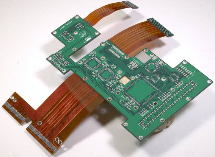
On HDI and high density boards the space between components disappears first, so the legend has to be reduced selectively, with the designators of the smallest parts moved to a free field rather than shrunk below the legibility limit. On flexible and rigid flex circuits the ink must tolerate bending, which pushes the choice towards thinner deposits and often towards laser marking of the critical identifiers. On heavy copper boards the surface is less flat, so the ink deposit has to be increased to keep coverage. On thick backplanes and press fit assemblies the connector pin numbering becomes essential and should be printed on both sides where a technician may only have access to one.
Common Problems and Their Causes
Clipped text is caused by artwork that was never checked against the mask and edge clearance. Smearing or ragged characters come from a screen that was too coarse for the character size, or from ink that was too viscous for the gap being printed. A legend that lifts after reflow usually points to insufficient cure or to printing over a contaminated mask. Text that is invisible in service usually means the reference designator was placed under the component body, or the colour was chosen for looks rather than contrast. Misregistration, where the ink shifts relative to the pads, is a process tolerance issue and is normally specified as plus or minus 0.1 to 0.2 mm; a design that leaves no margin for it will produce rejects at the assembly stage no matter how good the printer is.
Inspection Standards for the Legend
The rigid board specifications require the legend to be legible, permanent and correctly located, and an inspection normally checks character formation, completeness against the drawing, adhesion after cure, misregistration relative to the pads and freedom from ink on solderable surfaces. Because legibility is partly subjective, the practical acceptance criterion is whether an inspector can read the reference designator at the same magnification used for the rest of the inspection. For a serial number or data matrix the criterion is machine readability, verified with the same scanner the end customer will use, because a code that cannot be read is worse than no code at all.
What Silkscreen Adds to Cost
Legend printing is one of the least expensive steps on a board, usually a small fraction of the price, and it is included in most quotations without a line item. What raises cost is the exception: a second colour needs a second screen and a second pass, laser marking of every unit adds cycle time, and a design that requires an unusual ink or an unusually fine character size may need a process the shop does not run daily. In practice the cost of a poorly designed legend is not in the printing, it is in the assembly yield and the service time it causes downstream.
Design Checklist
Confirm the minimum text height and stroke width with the fabricator for the printing method chosen. Check every designator against the mask opening and the component courtyard, not just the copper. Move designators out from under components rather than shrinking them. Keep the legend off the board edge, the V-cut and the fiducials. Use one font and one colour, chosen for contrast against the mask. Put the critical identifiers, pin one, polarity and connector labels, where a technician can see them with the board installed. Have the fabricator confirm the artwork before the panel is released.
FAQ
What is the minimum silkscreen text height? About 0.8 mm for conventional screen printing and 0.4 mm or less with inkjet or laser, though inspector legibility rather than the printer usually sets the practical limit.
Can silkscreen be printed on pads? It should not be. Ink on a solderable surface harms wetting and solderability, so a clearance of 0.1 to 0.15 mm from the mask opening is normally required.
Which silkscreen colour is best? White on green, blue or black mask and black on light mask give the best contrast. Choose for readability and for the operating environment, not for appearance.
Is silkscreen tested for adhesion? Yes. Adhesion after cure is part of a first article inspection, and legend lifting after reflow is treated as a process defect.
Does silkscreen affect impedance or signal integrity? No. It is a printed legend over the mask and has no effect on the electrical performance of the board.
Conclusion
Silkscreen is the layer that everyone relies on and nobody owns, and that is why it is worth a deliberate pass before release. Set the text height and stroke width to what the printing process and the human eye can both handle, keep the ink clear of every mask opening and fiducial, choose a colour for contrast rather than for style, and confirm the artwork with the fabricator. Do that and the legend supports assembly, inspection and service instead of quietly eroding yield. The layout conventions that the legend has to respect are covered in PCB design and layout, the process limits behind the minimum text size are listed in PCB capabilities, and the fabrication and final inspection sequence is described in PCB manufacturing. A prototype PCB assembly build confirms that the legend, the footprints and the paste apertures agree before the design goes to volume in 2026.