




Silkscreen Legibility Rules Guide
Silkscreen legibility is the difference between a board that can be assembled and repaired by anyone and one that requires the layout file to be opened. The markings carry reference designators, polarity marks, pin one indicators and version numbers, and every one of them is printed by a screen or an inkjet at a resolution that is measured in tenths of a millimetre.
What the Silkscreen Is For
The primary purpose is identification. A reference designator next to a part lets an operator, a test engineer or a service technician find the component without consulting a drawing.
The second purpose is orientation. A pin one mark, a polarity stripe or a diode symbol prevents a part from being fitted the wrong way round, which is one of the most common assembly errors.
The third purpose is documentation. The board part number, the revision and sometimes a date code are printed on the surface, and they are the fastest way to identify a board in the field.
The marking is also the only feature on the board that can be changed without a new fabrication tool. A mask or a copper change needs new artwork and a new panel, while a designator can be moved in the data and reprinted. That flexibility is worth using when a marking turns out to be confusing on a first build.
The fourth purpose is a warning or a logo, and while it is not electrical it is often the marking that the customer notices first.
Line Width and Font Height
The minimum line width is set by the printing process, and a common limit is around 0.15 mm. A thinner line prints unevenly, breaks up and can disappear entirely on one panel and not on the next.
The font height has to be large enough to read without magnification on the bench. About 1 mm is the practical minimum, and 1.2 to 1.5 mm is comfortable for a board that will be repaired by hand.
The ratio between the height and the stroke width matters as much as either value. A tall thin character is harder to read than a shorter and slightly bolder one, and a condensed font is a poor choice for a marking.
The stroke should be at least a sixth of the character height, so a 1.2 mm character needs a stroke of about 0.2 mm. That is comfortably above the process limit and it prints cleanly.

Mask and Copper Interaction
Silkscreen is printed onto the solder mask, so the mask has to be present under the ink. Where the mask is removed to expose a pad, the ink has no surface to sit on.
The layout rule is to keep the silkscreen clear of any mask opening. The ink that crosses an opening is either clipped by the shop or printed over the pad, and a marking printed on a pad interferes with the solder joint.
The shop clips the ink automatically in most cases, which leaves a partial character and a marking that is harder to read. The better practice is to leave the clearance in the artwork so that the result is predictable.
Copper under the silkscreen also matters, because a raised trace on the surface makes the ink sit higher and can change the printing. A smooth surface gives the most consistent result.
Contrast and Colour
The contrast between the ink and the mask is what makes the marking readable. White ink on a green or a blue mask is the traditional combination and it remains the easiest to read.
A dark ink on a light mask gives a similar contrast and is used where the product has to look different. The choice is partly cosmetic, and the customer usually specifies the colour of the mask.
The contrast also depends on the gloss of the mask. A matte mask scatters the light and can wash out a thin marking, while a glossy mask gives a sharper edge and more glare under a lamp.
The ink has to survive the soldering process, the cleaning and the handling. A white ink that yellows in the oven changes the appearance of the whole board and is a common complaint.
Assembly and Service Use
The marking is used during placement, so the orientation and the polarity marks have to be visible after the parts are fitted. A pin one dot that is covered by the connector body is a mark that was never useful.
The marking is used during inspection, where the reference designator is compared with the drawing. A designator that is ambiguous, duplicated or placed far from its part slows the whole process.
The marking is used during repair, where a technician works without the layout file. The part number of the board, the revision and the location of a fuse or a test point all belong on the surface.
A connector and a switch often carry their own markings from the manufacturer, and those can be used instead of a board level designator. The practice reduces the clutter on a dense board, and it works as long as the part numbering is stable across suppliers.
A board that carries no marking is a board that will be repaired by guesswork, which is a reliability risk as well as a cost.
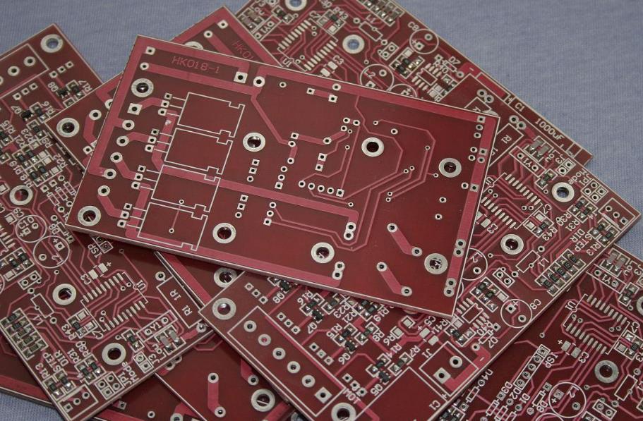
Fabrication Limits
The shop prints the silkscreen with a screen or with an inkjet, and the resolution of the process sets the smallest feature. The limit is quoted as a line width, and a stroke below it may be reduced or dropped.
The ink is cured after printing, and the cure affects the adhesion. A marking that is not fully cured rubs off during handling, and the failure appears as a missing designator rather than as a printing defect.
The registration between the silkscreen and the pads is a separate tolerance, and it adds to the clipping problem. The clearance in the artwork has to be larger than the registration error of the shop.
The fabrication notes should state the minimum line width that the artwork uses, so that the shop can adjust rather than delete.
Practical Rules
Use a stroke of at least 0.15 mm and a character height of at least 1 mm, and keep the ratio between them above one to six.
Keep the ink clear of every mask opening by the registration tolerance of the shop, and do not rely on the automatic clipping.
Place the orientation and polarity marks where they remain visible after the parts are fitted, and check that on a photograph of the assembled board.
Review the markings on the first article as part of the release checklist, and record the appearance standard with the quality record.
FAQ
What is the smallest readable silkscreen text? About 1 mm high with a stroke of 0.15 mm is the practical minimum. Anything smaller is difficult to read on the bench and may be clipped by the shop.
Why do some designators look half printed? Because the ink crossed a mask opening and the shop clipped it away. The clearance should be in the artwork rather than left to the process.
Does the mask colour matter? It matters for contrast and for appearance. White on a dark mask gives the best readability, and the choice is usually set by the customer.